|
|
Post by chalet on Aug 22, 2022 5:21:54 GMT
|
|
|
|
Post by no1novice on Aug 22, 2022 7:14:11 GMT
|
|
|
|
Post by Cartermrc on Aug 22, 2022 18:40:09 GMT
Not bad, but too much white as usual, except for the library. I'm waiting for that trend to crash.
|
|
|
|
Post by waterslide on Aug 22, 2022 19:49:08 GMT
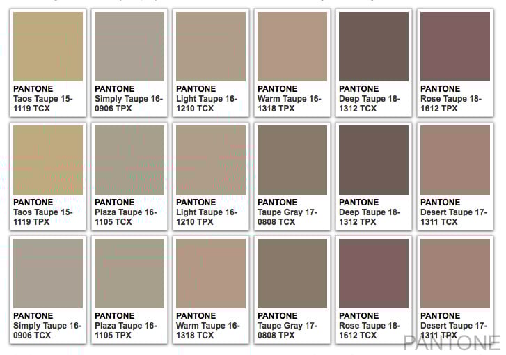
I love that kitchen floor and the dark library. And the dining room chairs in the 4th pic. I like the pic of him because it reminds me of a Dutch or Flemish painting. Everything is definitely pretty and calming and I don't spot a tacky thing as far as the eye can see. I am starting to prefer all white over muted/beiged/tan whatever. It reminds me too much of the Kardashians. I like other shades of lighter brownish greys...like the right side of this graphic.  |
|
trixie
OGs    stuck in the middle with you...
Posts: 2,105
|
Post by trixie on Aug 22, 2022 21:37:34 GMT
I could not live without color. And my neutral is gray.
|
|
|
|
Post by waterslide on Aug 22, 2022 22:03:23 GMT
My neutral is black. lol I am trying to stop being like a cave-dwelling hermit. But I love the contrast of colorful art pieces against a white background more than beige. Beige angers me unless it has a reason for being there.
|
|
trixie
OGs    stuck in the middle with you...
Posts: 2,105
|
Post by trixie on Aug 23, 2022 14:24:20 GMT
Not a fan either. I remember when "earth tones" were the thing, I hated them and called them the mud tones. The people we bought this house from were very into the mud tones. Brown wall to wall carpet, beige in the bathroom. The first year, if I wasn't at work I had a paint brush in my hand.
|
|
|
|
Post by beeyotch on Aug 23, 2022 15:02:59 GMT
I dislike the gray everything. The wood floor, the staircase, the walls, desaturated wood furniture looks grayish too. Except the marble, that looks nice. Not a fan of the furniture style, either. It all looks drab and dreary.
The mouldings on the ceilings and walls are pretty.
|
|
|
|
Post by kittylady on Aug 24, 2022 2:15:03 GMT
I dislike the gray everything. The wood floor, the staircase, the walls, desaturated wood furniture looks grayish too. Except the marble, that looks nice. Not a fan of the furniture style, either. It all looks drab and dreary. The mouldings on the ceilings and walls are pretty. I wonder how much of that is down to the photography filters? I think that this would actually look much better in real life and natural light and I can see how adding in some personal items could really lift it into something homely and inhabitable. |
|
|
|
Post by no1novice on Aug 26, 2022 23:12:31 GMT
I love that kitchen floor and the dark library. And the dining room chairs in the 4th pic. I like the pic of him because it reminds me of a Dutch or Flemish painting. Everything is definitely pretty and calming and I don't spot a tacky thing as far as the eye can see. I am starting to prefer all white over muted/beiged/tan whatever. It reminds me too much of the Kardashians. I like other shades of lighter brownish greys...like the right side of this graphic.  Funnily enough I have that rose-taupe/desert taupe colour in my bathroom with a very cool faux grey/white marble that has a hint of tan in it + the rose warms it up & makes it lovely rather than "institutional".... The rest of my house are mutee blue/greens + lilac in my bedroom. |
|
|
|
Post by daphodil on Aug 26, 2022 23:26:25 GMT
I like the vibe of the contemporary and the rustic, it softens the contemporary edges. I love the colors too, but they're a bit too muted for me. Then I looked at all the off-white walls in my house and realize those colors are bold, bold, bold for my palette. LOL
|
|
|
|
Post by sputnik on Aug 27, 2022 3:08:38 GMT
it's a nice space, and i like the finishes and architectural details and there are some great pieces but it also looks very impersonal and like everything that's been trendy for the past 5 years, there's nothing new or creative about it.
|
|
|
|
Post by louiswinthorpe111 on Aug 28, 2022 0:50:53 GMT
The furniture looks uncomfortable as hell.
|
|
|
|
Post by lindsaywhit on Sept 2, 2022 20:29:26 GMT
It doesn't it? Didn't even notice it until you pointed it out. I had to scan thru pretty quickly - zigzag & even some geometric designs are migraine triggers for me.
It was better than expected for me since I don't trust his shady ass.
|
|
|
|
Post by chalet on Sept 3, 2022 19:14:40 GMT
THANK YOU NOVICE! I appreciate the photo posting.
The pantone palette looks like a Too Faced eyeshadow palette I have.
|
|